
Colours that boost productivity in work spaces
In the world of workspace design, every detail matters, and colour is one of the most powerful elements to influence the mood, concentration and productivity of employees. Choosing the right colour palette not only enhances the aesthetic of the work environment, but also directly impacts the performance and wellbeing of the team. In this article, we’ll show you how to use colours strategically to design more efficient and stimulating workspaces.
The impact of colour on productivity
Studies on colour psychology in workspace design have shown that certain shades can influence human behaviour. In the context of workspace design, the choice of colours can stimulate creativity, reduce stress and improve focus, depending on the goal of each area.
Recommended colours to boost work performance
Blue: concentration and trust
Blue is one of the most commonly used colours in offices. It conveys calm, professionalism and aids concentration. It is perfect for spaces where you need to focus and make decisions.
Application: meeting rooms, analysis or administrative areas.
Green: balance and well-being
Green always reminds us of nature, which is why it helps reduce visual stress. It promotes a relaxed and balanced environment, making it ideal in settings where people spend long hours looking at screens.
Application: common areas, rest or coworking spaces.
Yellow: energy and creativity
It’s one of the most energetic colours. It helps stimulate the mind and improve mood. It’s ideal for enhancing innovation and collaboration among workers.
Application: creative rooms, brainstorming areas or creative design spaces.
Orange: motivation and dynamism
Orange is vibrant and stimulating (similar to yellow). It is associated with enthusiasm and action. It should be used in moderation, as it increases energy and motivation levels.
Application: high-traffic areas, cafeterias or interactive spaces.
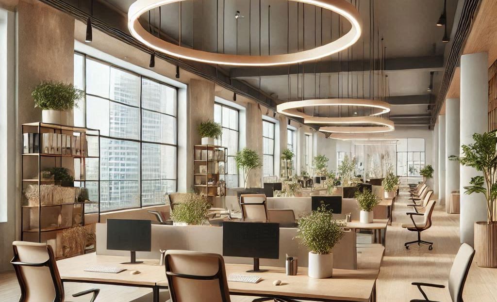
White and neutrals: spaciousness and clarity
Neutral tones create a sense of order and cleanliness. When combined with accent colours, they highlight key areas without overwhelming the environment.
Application: base for any modern and minimalist workspace.
How to integrate colour in workspace design
WALLS AND CEILINGS
Used to set the general tone of the space and define the general colour pattern and the sensations associated with it.
FURNITURE AND DECORATION
Add colour with desks, chairs or shelving, keeping in mind whether you want to follow the overall scheme or create a contrast.
LIGHTING
Light can alter how colour is perceived, so it is necessary to consider natural light and the use of appropriate artificial light temperatures.
ZONES
Different colours can be used to define spaces with specific functions within the same environment.
Moinsa, experts in the design of shops and commercial spaces
The smart use of colour in workspace design can be a key catalyst for optimising your business. Therefore, colour in office interior design is not just an aesthetic choice, but a functional strategy that contributes to organisational success. Investing in the design of work environments is investing in human capital.
Contact us for more information or a no-obligation quote.